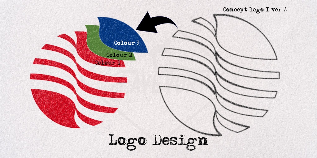
Logo design

Logo design - what makes a successful logo?
A logo serves as the visual representation of a brand, distilling its values, mission, and identity into a single, memorable graphic. Designing a successful logo is not just about creating an aesthetically pleasing image—it’s about crafting a symbol that resonates with the target audience and effectively communicates the essence of the brand.
1. Simplicity
A successful design is simple and easy to recognize. Think of iconic logos like Apple, Nike, or McDonald’s. These designs are minimalistic yet powerful because they don’t overwhelm the viewer with complexity. A simple design ensures that the logo is versatile, scalable, and legible across different sizes and mediums. Simplicity also makes the logo easier to remember, enhancing brand recall.
A clean and straightforward logo works across a variety of platforms—from business cards to billboards—while remaining easily recognizable.
2. Memorability
The best designs stick in the minds of consumers. A memorable design is one that people can quickly recall after just a glance. It should be distinctive, meaning it stands out from the competition, and has unique visual elements that set it apart. The more unique the design, the easier it will be for people to associate it with a specific brand.
Brands like Coca-Cola and Nike leverage simple yet powerful logos that instantly evoke their identity, triggering emotional connections with their target audience.
3. Timelessness
A great design should have longevity and not be overly influenced by trends. While design trends come and go, a timeless one endures the test of time. Logos like Coca-Cola, Shell, and Ford have evolved, but their core designs have remained largely the same for decades.
When creating a logo, it’s important to focus on the long-term goals of the brand. Avoiding overly trendy elements ensures the design doesn’t quickly appear dated. A timeless design focuses on clean lines, classic colors, and strong, simple typography.
4. Versatility
Logos must work in various contexts and applications. A versatile one looks just as effective on a business card as it does on a billboard or a digital advertisement. The design must be scalable—meaning it should look clear and legible whether it’s large or small.
Additionally, it should work in black and white as well as color. While color adds personality, a logo must still be recognizable and effective without color. A versatile design should maintain its integrity whether it’s printed in full color, grayscale, or displayed on a website with a transparent background.
5. Relevance
A good design aligns with the brand’s industry, values, and target audience. It should communicate the company’s mission and personality through visual elements like shape, color, and typography. For instance, a law firm’s logo will typically exude professionalism, seriousness, and trustworthiness, while a children’s toy brand might use playful colors and rounded, friendly shapes to appeal to a younger audience.
Colors, fonts, and design elements should all be thoughtfully chosen to evoke the appropriate emotions and associations for the brand.
6. Uniqueness
Best designs should distinguish a brand from its competitors. A unique design is essential for establishing a distinct identity in a crowded marketplace. If it looks too similar to others, it can confuse customers or dilute brand recognition.
The key to uniqueness is to ensure the design is tailored to reflect the brand’s personality and values, without borrowing too much from common symbols within the industry. For example, while many tech companies use blue to communicate trust, it should still have elements that make it stand out from others in the field.
7. Appropriate Use of Color
Color psychology plays a significant role in the effectiveness of a logo. Colors evoke emotions and associations, and choosing the right color palette is crucial. For instance, blue is often used for its associations with trust and professionalism, making it popular in industries like finance and technology. Red can represent passion, energy, and excitement, while green is linked with nature and health.
The use of color should be deliberate and aligned with the message the brand wishes to communicate. It’s also important to ensure that the design works well in both full color and black-and-white formats.
8. Typography
The font or typeface used in a design is just as important as the graphical elements. Typography should complement the logo’s design and reflect the brand’s personality. Whether it’s a strong serif font for a law firm or a rounded, playful type for a toy company, the right font enhances the overall impact of the design.
Typography should also be legible and scalable. A font that looks great at large sizes may become illegible when shrunk down for business cards or social media icons.
9. Emotional Impact
Great designs resonate with people emotionally. It establishes an emotional connection by embodying the core values of the brand. Whether it’s the sense of adventure evoked by the Nike swoosh or the feeling of trust and reliability signaled by the FedEx logo, a design should inspire positive associations.
Effective designs evoke feelings that align with the brand’s core mission and values, leading to customer loyalty and stronger brand recognition.
In conclusion, a successful design isn’t just a pretty picture—it’s a powerful marketing tool that communicates a brand’s identity, values, and message at a glance. To be effective, it should be simple, memorable, timeless, versatile, relevant, unique, and impactful. It should also connect emotionally with the target audience and remain adaptable to future uses. By following these principles, designers can craft designs that stand the test of time and help brands succeed in an increasingly crowded marketplace.
Let me help you create a successful logo, contact me to find out more.